Monday, April 21, 2014

Fiesta Fun


             Inside Right Flap                                    Back                                            Front Cover

                   Inside Left                                              Inside Right Spread

Tri-Fold Brochure for Fiesta Fun

I was in charge of making the brochure for the Fiesta Fun campaign. Everything is based off the style guide our group decided to use, blue, green, red, cream/yellow, and pink. The overall composition of the brochure has some orderly and non orderly qualities to suite all ages. The colors help give off a fiesta feel, as well as giving off a kid friendly, fun environment look. I wanted the brochure to please all ages and used shape and color to do so. The circles were inspired by the ball pit and the many colors that it has; which created the child friendly look to the brochure . The squares and the straight alignments give it more the adult look.
I incorporated gestalt principles to the brochure which are the Law of Similarity, found by the similar shapes. The inside of the brochure has circular photos which are grouped to show they are together and under the same topic. Law of Proximity is an example of the front cover, the photos and squares are placed to make it look like a circle. I wanted to have the viewers eyes move across the page so I used the Law of Continuity on the inside of the brochure. The placement of the circular photos are in placed in the shape of a circle as well, draws your eye to the testimonial for Fiesta Fun. The background red and white curved lines are to draw the viewers eye down to the rest of the photos on the bottom for more photos of the attractions.
For contrast in my brochure I used contrasting colors on certain sections of the brochure. When you open the cover you see green and red, which are contrasting colors. Inside blue and yellow are used which also are contrasting.
Figure ground relationships I wanted to have to viewers look at certain things, in a certain order, and what's more important. Attractions have the biggest spread, and largest font size. This shows that it is the biggest thing to Fiesta Fun. Designs in the background of the brochure lead the viewers eye in interesting ways while leading them to specific information.

Sunday, March 30, 2014

Mis-en-Scene


Screen Shot 2014-03-27 at 10.46.26 AM.png


Shelbi Davis. Key grip/gaffer.
There are many scenes in the movie, “The Secret Life of Walter Mitty” that create great visceral response to the viewer. The scene of Walter and the two guides taking their journey through the Himalayas was one of them. The location chosen, Iceland, has beautiful scenery and was a key part of the viewers’ response, but how the location was presented is another big factor in creating a good response. The presentation is choreographed by the cinematographer or the director of photography. Much thought is put into determining the look and feel of the scene, but to take the vision that the producer and photographer have in mind is dependent on the key grip and gaffer to execute it. These departments work for the director of photography, and are the supervisors and chiefs of their own grip crew. The key grip supervises the crew of grips responsible for camera equipment, and camera operation and movement. The key grip will attend location scouts and meets with the DP to determine what additional equipment (location-specific motor vehicles, dollies, cranes, mounts, etc.) will be needed. Once on set, the key grip will coordinate with the electric and camera departments, which leads to the gaffer. The gaffer is head electrician, responsible for the execution of the lighting plan for production. Although, in an interview about the Secret Life of Walter Mitty it was said the interior scenes were all light with standard lighting set-ups, all exterior scenes were shot with natural light.  The New York City scenes were shot during the summer, then the crew relocated to Iceland in September when the weather was reportedly most favorable. There was not just one specific key grip/gaffer listed for this movie but there were at least four each in both departments of key grip and gaffer. Key grips are Mitch Lillian, Eric Gearity, Arnar Einarsson, and Kevin Lowry. For key gaffers are Bill O’leary, Eric Boncher, Mo Flam, Ingvar Stefansson.
These two departments were able to help reach visual communication to its viewers by choosing and setting up equipment for the desired look the DP ordered. Where the camera is placed in relation to the subject can affect the way the viewer perceives the subject. For the movie, Walter and the guides are portrayed so small compared to how big the Himalaya (Iceland) mountains are.  The high and wide angles create that, so special equipment had to be chosen or built to film in that specific location. The design principles were the high angled views that swooped above their heads, and birds eye views showing how big the location is. Although it was not released how or what equipment was used to film the hike, one can assume cranes, dollies, and helicams/helicopters all could have been used for the filming design process. Also, to make the most of the film’s photographic elements, The DP chose Kodak film and shot on Arricam SP and LT camera with Hawk V-Lite lenses. Without these departments it would be hard to obtain the desired design principles to tell the story of Walter’s journey.

Wednesday, March 5, 2014

Frame

I noticed that someone had the same idea as I did to go to the Willard O. Nisson park and take a picture of the water wheel. Besides the road, houses, and cars behind it, it's a really pretty water wheel. For the diagonal rule, I did not put the horizon at the bottom.  I wanted more greenery, water, and wheel, instead of sky.  My horizon line is towards the top of the picture and on the top horizontal grid line. I think the horizon draws your eye to the water wheel.  I lined the top right grid intersection up to the middle of the wheel.  I think the vectors located in this image are formed by the diagonal lines at the base and top of the brick columns, including individual bricks, that all point to the end of the pond. I really like the light reflecting on the water, it created another diagonal line like the brick columns are. Also light is beating on the lower rock, it is a diagonal line as well that points to that direction. I think those diagonals give it perspective and depth. I think all these lines would be considered the graphic vectors.

Sunday, March 2, 2014

I chose to do this analysis on the Aston Martin website.  What caught my attention first was how the sliding screen was used for the whole background when usually the sliding screens are a small rectangles positioned in the center top of a website.
The business objective of this site is for the advertisement, market, and sale of Aston Martin vehicles.
This site is very efficient and has a strong grid.  I think the grid is simple which makes the website readable, and eye catching. There are few boxes and text that would make it cluttered.
If you click on the links above to navigate the site, they start the images on the right, and the further you scroll down the images alternate sides which create good eye flow to lead the viewers eye throughout the web page.
The website is very user friendly for first time viewers, because right on the homepage you have four boxes below with images and text depicting what you might be looking for. Simple and straight forward.
Contrast is located in this website from the images next to the black background. The black background contrasts with the cars that are mostly brightly colored, making them pop and grab the viewers attention.
They used the rule of thirds with the placement of cars in the images.  The cars were not placed right in the middle of the website or image, you can notice the cars are placed on the side of the image.  I feel that this also makes the website aesthetically pleasing.
The Aston Martin website is fitted for mobile and other devices and looks appealing on those as well.  I think this website did a good job meeting the requirements of Rutledge's axioms.

Wednesday, February 12, 2014

I took a stroll through Target to find some interesting font combinations, and was surprised it wasn't as easy as I thought it would be considering type is on every single product.  Everything was so simple and generic and seemed to have the same font after another.  But I came across this one and liked this font combination the most.  For one, the fonts describe their word.  Cake has a font with a sense of elegance, which I can see a relation to cake and elegance.  It could be that cakes have design, or can be kind of girly looking, which is what this font looks like. The font used for the word boss, it works perfect to relate to the word.  Boss is bolded, its more business looking, straight to the point...like a boss. For the two fonts combined they contrast each other.  Two very different styles, yet it's appealing.   For some reason my eyes are drawn to this type of contrast. You would think such different fonts would be ugly but this one just grabs my attention.  I think the font choices, with this type of contrasting combination, describe Cake Boss quite well.

Tuesday, February 4, 2014

Design Evaluation


     Good Design.  Ice Fantasy Premium Ice Creams were going for a more classic look to their packaging, and I think they did a pretty good job with that.  First thing I noticed was the positive and negative space and how they used it.  I thought it was pretty innovative the way the scoop of ice cream creates the top section of the package, creating a separation in design.  Even though the ice cream scoop is cut off, the law of closure plays a part where our mind complete the other half.  I liked the rounded handle that is also half circular like the ice cream, which this can follow two more laws.  Law of continuity makes our eyes follow the smooth path around the half circle of the scoop and handles. We can group the handle and scoop shapes based on their similar design as the law of similarity.  Contrasts between the dark backgrounds make the color of the ice cream pop, and seem rich.  Subtle colors bleed into the dark background making a connection between the top and bottom sections.  The design is not cluttered or have unnecessary images, it's strictly focusing on its product and its classiness.
     The Heart brand ice cream is also a design packaging that I think is great.  I notice the continual line starting from the top with the melting syrup falling on the ice cream, then your eye gets drawn to the other image on the bottom left corner. There is a balance with the images on different sides, and text on different sides as well.  The two background colors contrast, and make the top color pop and catch your eye.


Bad Design.  I think we can all agree Blue Bell Ice cream is a bad design.  I feel not a lot of gestalt priciples are present at all.  Its plain, and has terrible color.  Catches my eye because of the color, but also makes cringe.  I think that some sort of color or image to show that the flavor is cookies and cream would have helped, because it seems that the flavor is lemon.  You have to search the label to find the flavor.  Usually designs I know right off the bat the flavor because they incorporate the color of the flavor into the package design.  Very flat, definitely looks cheap; which it may be cheap and not high end like my images above, but I know for fact that I have seen better design than this package that were homemade packaging and very very low cost.  I did look up this brand, and it is higher end than it looks.  There is an updated version of this ice cream on the link below, but the only updated part is really the size and colors. Still lacks real design.  http://houston.culturemap.com/news/restaurants-bars/04-26-13-blue-bell-debuts-a-new-ice-cream-flavor-and-you-wont-believe-what-its-fit-for/
    

Wednesday, January 22, 2014

Contrast, Balance, Harmony


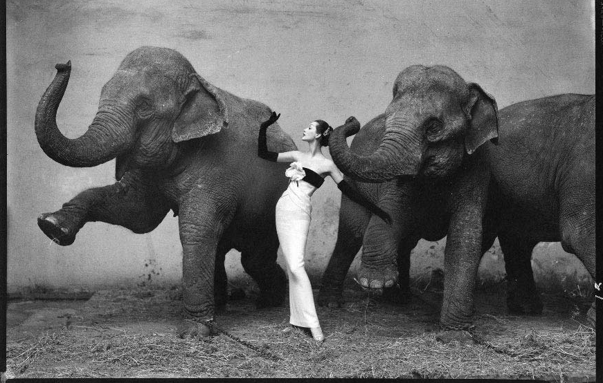
I love everything about this photo by Richard Avedon.  He has beautiful contrasting black and white photos, but my favorite is this one.  This photograph called Dovima with Elephants, and evening dress by Dior, at Cirque d'Hiver was taken in 1955.  The beauty within this photograph is emulated by contrast, harmony, and balance.  The first thing I noticed was how Dovima's white dress makes her stand out between the elephants dark grey skin, and shadows.  I also see contrasting figures and texture by the rough and dirty elephants compared to sleek, elegant Dovima and the dress.  I feel with these high contrasts I cant take my eyes off the dress and Dovima, which is where I believe the cognitive aspect comes into play.  The goal that Richard was trying to achieve is to show off or advertise the dress from Dior.  He created that psychological response to viewers making Dovima's dress be the subject that was most likely looked at first or more often in the picture.
The elephants' poses and actions portray an energetic yet harmonious feel, even though Dovima and the elephants are very different, it still seems to be a pleasing combination.  I especially love the cultural uniqueness shown with an elegant women posing just like the elephants, in a probably very expensive dress.  Normally in real life (not posing for photographs), you wouldn't see a women in a beautiful expensive dress next to a giant animal covered in dirt.  Which makes the photo even more interesting.
Balance and harmony tie the photographs subjects together by a couple of ways.  The photo has a dusty look, but what seems to balance the photo is the clean dress right in the middle.  Her pose imitating the elephants balance the photo as well, creating a more organized, unified, and harmonious look.